Cereals’ advertisement jingles often sing of their glorious health benefits. But are cereals really that healthy? Below, I have used a dataset on 80 cereals from Kaggle to help users investigate the health breakdown of their cereals. This project was a remake of another visualisation I found on Makeover Monday by Max and Sam Preston
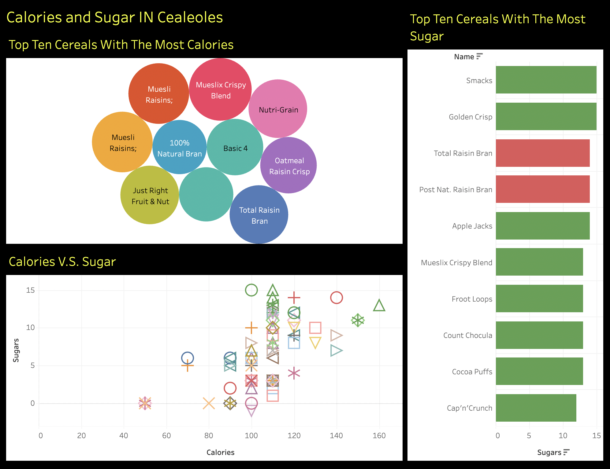
Original Viz
What’s wrong with this Viz? That’s kinda obvious. First off, do viewers really want to know what are the sugariest cereals – maybe they don’t even eat that cereal. Second, it’s hard to make out what the most sugary and least sugary cereal among the ten is. Lastly, for the sugar vs calorie graph, what exactly is it saying – what are those shapes, really?
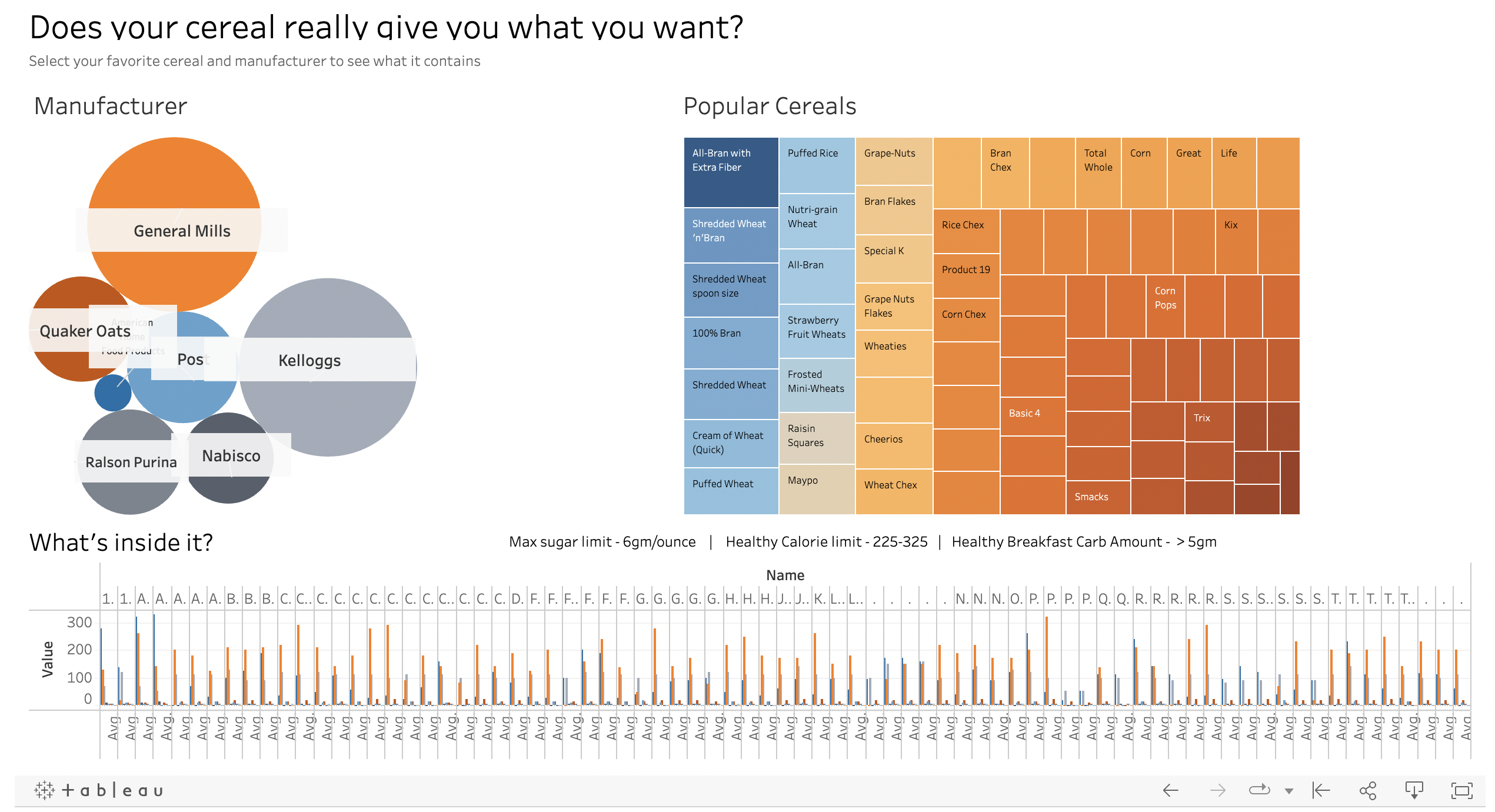
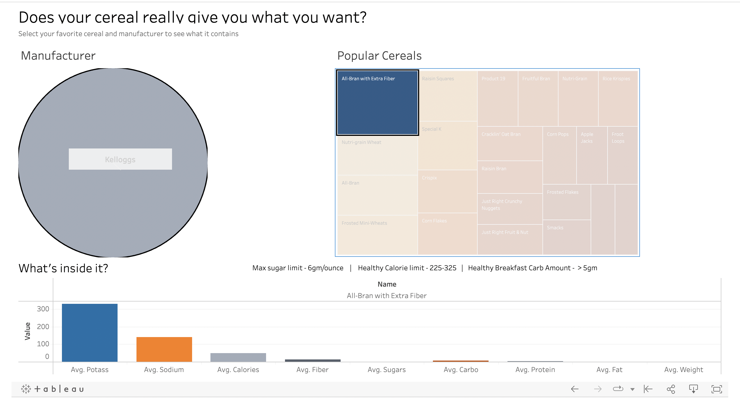
What I have done differently
Start with the user. Most likely, what viewers want to is – what exactly does the cereal I eat have? That’s why I thought it best to provide visual filters for the users to select their favorite and view its states
The filters add a sense of interactivity
The colours are colour-blind safe
There are clear labels on what each visual depicts
There is context information on the healthy amount of sugar, calories, carbohydrates, etc in cereals
Limitations & Biases
Start with the user. Most likely, what viewers want to is – what exactly does the cereal I eat have? That’s why I thought it best to provide visual filters for the users to select their favorite and view its states
The filters add a sense of interactivity
The colours are colour-blind safe
There are clear labels on what each visual depicts
There is context information on the healthy amount of sugar, calories, carbohydrates, etc in cereals